Thursday, October 29, 2015

Personality Type Test: The INFP

Ariel Seemann is an INFP


Today we took a few tests about personality. The personality tests are about 40-50 questions that put your personality into four letters.

-Introvert vs. Extravert
-Intuition vs. Sensing
-Feeling vs. Thinking
-Perceiving vs. Judging

So this means I am an Introvert (preferring to be alone), Intuition (focusing on the future), Feeling (concerned with my own feelings rather than thoughts), and Perceiving (not planning ahead for something, then winging it).

So, what's your personality type? Here's a test to find out: http://www.humanmetrics.com/cgi-win/jtypes2.asp

Me


J. R. R Tolkien and John Lennon! Yay!!

Characteristics of the INFP


Sorry these pictures are so small, they were cutting off of the post. Well, that's all I have to share.

Thursday, October 22, 2015

Six Shots System (Photo and Film Tutorial)

Now I am on to video class. One of the first things we learned about is the six shots system.

What it is.

It's a way to take interesting, professional shots. The frame is split into nine portions (you may have seen this option on your phone camera or Instagram). The points of interest should be placed where the lines intersect, called cross-points. These are pictures, but this rule is also applied to film. I photographed my friend doodling to show the six shots.

Over the Shoulder


The name is pretty self-explanatory. You take a shot of what people are doing over their shoulder. This gives a third-person perspective, like you are a person looking over their shoulder.

Hands Close Up


What are hands for? Their for doing things: picking stuff up, typing, drawing, etc. That's what this shot is about. It's a close up of the hands when they do something interesting.

 Close up of Face


This is my friend, as you can see. Here you can kind of see some emotion, but we just want to focus on her entire face to see what she's looking at and see the smile too. An extreme close up of the face would show just the eye or something. Due to the awkwardness of holding a camera that close to the face though, our teacher says we don't need one.

 Medium


Most of the shots with people are used to show a trait of the character. Wide should be for first showing the character, but this is medium. It's half the body, so at about the hips or waist up. Sometimes entire character shots have too much extra background, so this one is used.

 Wide


Like I said, this would be used for showing the character for the first time, head to toe. That way so we can get a full sense of what they look like.

 Extreme Wide


Finally, we are at the last one. This is a far away shot of all the characters. We see the desks and the computers and everything else. This is too show the setting of the shot.

The End.

Well, now you can go make your own photos and videos. Oh, and one last note. Use all of these, and vary them. However, especially for extreme wide, don't use them too often. "Yes, I know this is filmed in NYC, can I just see what they're up to?" Even if your talented with beautiful shots, your viewers will get bored if there are just too many. Well then, good luck to you! :)

Thursday, October 8, 2015

Writing my Name (Animation)

This will be a tutorial post about writing a name in Adobe Photoshop CS6. As you can see, I did it with my name, even though it was a tiny bit of a challenge. However, it shouldn't be professional animation level, so don't worry. I can walk you through the steps.

First Step: Getting started

The very first thing you need to do is click file and then new. Depending on how long your name is, you will need to make a long landscape image. 600 by 150 pixels was fine for me.

It should look like this, with a canvas and automatically created a background layer.

Make a new layer, it's the button that looks like a turning page under the layers section. All your layers should be transparent except your Background. ALWAYS CREATE A NEW LAYER AFTER MAKING A CHANGE TO THE IMAGE!!! This way so that if you mess up, you don't have to start all over.
Optional: Rename it something else by double clicking it. This is not necessary, but it can keep your layers identified which one is which.

Step Two: The Text

Type your name on that layer with the type tool (Horizontal Type Tool).


The layer should be a text layer, but we need it to be paint-like. Right click on the layer and rasterize it.
Now create a new layer, except this one needs to be just like the previous one. So instead of clicking the new layer button, duplicate the layer.
A window will pop up. It just says what size the layer is, what you want to name it and such. Keep everything the same, and just click Okay.

Step Three: Work on the Text

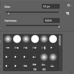
Now, here is the fun part, although is is quite tedious. You will slowly erase it backwards, bit by bit. Select the eraser tool. NOT THE MAGIC ERASER TOOL. That makes your entire name disappear. Trust me, I learned that the hard way.


Make sure the hardness is at 100%


Since "n" is the last letter of my name, I will erase a little bit off the end. Work backwards, so when you animate it, it will look like handwriting.


Done with the last name.


Finally, when your name is completely gone, it's time to start the animation. This part will be short and easy.

Step Four: Animating

You may already have a timeline out. If you don't, get it there. Go to window and check timeline.


It should appear at the bottom of your interface. The button should either read create frame animation or create video timeline. Choose frame animation, and click it.


There is a little tiny menu button on the top right corner of the timeline. You might be able to see it in the top picture, but here is a close up.


That menu is pretty much all we use to animate it. Click it, and make your layers into frames.


Remember: Your layers were transparent. You still have that plain white background layer, right? Good, now we use it. Shift click and select all your frames.


Look to your layers menu, and click the eye on the background layer. If it is already brightened, click it twice.


If you play your animation though, it will be written backwards. We need it to look like handwriting though, so you must flip the frames.


I already did that when I took the screenshot, but it will be brightened. Click it.
Now your animation is complete. (Yay!) But you still need to export it. I'm going to export as a gif. Go to the file window, and click Save for Web.


You should get this window.


Make sure it's a GIF 128 No Dither. Everything looks good, click Save. If you choose done, it'll just save your settings.


Yay! NOW you are fully done. Play your Gif, post it on the internet, show it to friends. Do what ever you want with it.

Sketchup House with Glass Roof


In class, we are starting to use a program called Sketchup, and I am in love with it! Especially the guy that comes up when you start the program. The program was easy to use for me, because I used it in stagecraft class last year. Although, the animation part where the camera goes 360 degrees around the house was new. All you have to do is pull up a scenes window and and add scenes. They remind me of frames, even though (believe it or not) I only had 9 scenes. I am probably going to get this program for my home computer so I can use it all the time.